Online, First Impressions Are Everything
You’ve worked hard to build your business, from all your real expertise to those hard-earned five-star reviews.
But when a potential customer lands on your website for the first time, none of that carefully garnered reputation that you’ve built matters yet. None.
All they see is what’s in front of them, and it takes a matter of seconds to form an opinion.
Research consistently shows that it takes about seven seconds for a visitor to decide whether they trust your website enough to stick around. Seven seconds. That’s it!
That’s not enough time to read your “About” page, browse your services, or watch an intro video. It’s barely enough time to blink.
And yet, in that window, your potential customer is already answering a question they may not even realize they’re asking: “Does this business look like it has its act together?”
If the answer feels like “no,” poof! They’re gone. And research suggests that they probably won’t be back.
Here’s what customers are actually deciding in those first few seconds, and what it means for your business:
“Can I Trust This Place?”
Trust is the first thing a website either builds or destroys.
Visitors aren’t consciously auditing your site for credibility, but their brains are doing it automatically. A clean, modern design signals professionalism.
An outdated, cluttered, or visually inconsistent site signals the exact opposite, and that association transfers directly to your business.
Think about the last time you landed on a website that looked like it hadn’t been updated since 2012 (or earlier).
Did you feel confident handing that company your money or your personal information? Probably not. Potential clients feel the same way about your site if it’s outdated.
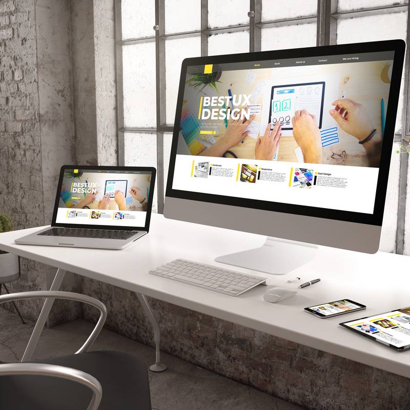
Credibility is boosted by consistent, high quality marketing such as professional photography, memorable branding, and a polished layout.
These aren’t just aesthetics, either. They’re the signals that tell visitors you’re a serious operation that pays attention to detail.
“Is This What I’m Looking For?”
A new visitor quickly determines whether or not they’ve come to the right place.
If your homepage doesn’t clearly communicate what you do and who you serve at first glance, people won’t stick around to figure it out. They’ll simply leave to find their solution elsewhere.
This is one of the most common mistakes small businesses make: assuming that visitors will take the time to explore. They won’t!
Your homepage needs to answer “what do you do and for whom?” immediately. Not buried in a paragraph halfway down the page; it must be front and center the moment the site loads.
Here are three ways to establish that immediate authority:
- A strong headline
- A clear description of your services
- An obvious sense of who your customers are
If your homepage currently leads with a vague tagline like “Excellence in Everything We Do,” it’s time to rethink your approach.
“Can I Find What I Need?”
A confusing or overwhelming navigation menu can stop visitors in their tracks.
People expect websites to behave predictably, with a simple menu at the top, a clear path to services or products, and an easy way to get in touch.
When navigation is cluttered, inconsistent, or hard to find on mobile, visitors experience friction. This leads to frustration and clicking away to your competitor.
The goal of your navigation isn’t to showcase everything your business offers. It’s to get the right person to the right page as quickly as possible.
“Does This Work on My Phone?”
More than 60% of all web traffic now comes from mobile devices. That’s a number worth sitting with.
That means the majority of people who find your business online do so on a phone, not on their computer. If your website isn’t optimized for mobile, you’re making a poor first impression.
If your site isn’t optimized for mobile devices, it can break down when viewed on a phone. Expect issues such as tiny text, images that don’t load, or buttons that are impossible to tap.
This makes your site difficult to navigate on mobile devices, and it also tanks your search rankings. Remember that Google prioritizes mobile-friendly sites in its search results.
If you haven’t pulled up your own website on your phone recently, do it right now. What you see is what potential customers see!
What This Means for Your Business
The seven-second window isn’t a reason to panic. It’s a reason to take your website seriously as a business tool.
A well-designed, fast-loading, mobile-friendly website that communicates clearly and builds trust immediately is NOT a luxury. It’s a necessity that can be the difference between a lead and a lost visitor.
The good news is that these problems are fixable.
A thoughtful website refresh built around how real customers actually behave can meaningfully turn visitors into inquiries, and inquiries turn into customers.
If you’re not sure whether your website is making the right impression, a fresh set of expert eyes can make all the difference. Bold Media specializes in building websites that look great and work hard for your business from the very first second.
Ready to find out what your website is really telling customers? Contact Bold Media today for a free consultation!